
Why Product Colors Change Across
E-Commerce Images
A dark blue jacket looks correct in the main product photo. In another angle it appears slightly purple. In a lifestyle image it looks lighter again.
Each photo may look fine on its own. The problem becomes obvious when they are displayed together.
Lighting, white balance, RAW processing, reflections, monitor calibration and export settings can all affect product color. Keeping a catalog consistent means controlling these differences throughout the workflow rather than trying to correct everything at the end.
Color accuracy and consistency are not the same thing
Color accuracy means representing the actual product as faithfully as possible.
Color consistency means keeping that representation stable across the complete image set.
A series can be consistent and still have the wrong color. The opposite can also happen: individual photos may look correct, but differ noticeably when placed next to each other.
For e-commerce, both matter.
The goal is not to make every image identical. A lifestyle photo can have a different atmosphere from a clean product shot. What should remain coherent is the appearance of the product itself.
Why color changes between photos
Differences can begin during the shoot.
Changes in lighting, reflections, exposure and white balance all affect how color is recorded. Materials such as metal, glass, leather and fabric can also react very differently depending on the direction and quality of the light.
RAW processing introduces another layer. Camera profiles, white balance and individual color adjustments influence how the original file is interpreted.
Capture One, for example, includes a Normalize tool designed to equalize color and luminosity between images using a reference point.
The important point is that consistency cannot be created by one adjustment alone.
References become more important as a catalog grows
Consistency is relatively easy to evaluate during one controlled shoot.
It becomes harder when images are produced across several sessions, collections or photographers.
Approved reference images can provide a visual target for new work. Instead of deciding from scratch what a product or background should look like, new photos can be compared with something that has already been validated.
Color charts or neutral references can also provide additional control during capture and RAW processing.
They do not replace visual judgement, especially with reflective or textured materials, but they reduce unnecessary variation.
Your editing monitor is part of the process
Color decisions are only useful if the display used to make them is reasonably reliable.
Adobe recommends calibrating and profiling a monitor for more predictable color. A monitor profile allows color-managed applications to account for the characteristics of that specific display.
That does not mean every customer will see exactly the same result.
Phones, laptops and monitors have different display characteristics and settings. Those devices are outside the control of the photographer, retoucher or brand.
The realistic objective is therefore to produce a controlled source image, not to guarantee identical color on every screen.
Export settings matter too
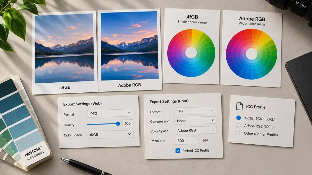
The color space used at export affects how colors are described in the final file.
For online use, sRGB is generally the safest choice because it is widely supported by browsers and e-commerce platforms. For some print workflows, Adobe RGB can preserve a wider range of colors.
When a file is exported with the wrong profile, or that profile is not interpreted correctly, colors can appear less saturated or shift from the intended result.
The right export therefore depends on where the image will be used.
The fastest check: look at the series, not only the image
A simple way to detect inconsistencies is to view the images together.
A grid or contact sheet makes differences in product color, exposure, contrast and background tone much easier to see than examining every image individually.
Instead of asking only:
Does this photo look good?
ask:
Does it work with the rest of the series?
This is where professional post-production becomes particularly important. The goal is not simply to improve individual images, but to maintain a coherent visual result across the complete set.
What should be defined before post-production?
A useful brief does not need to explain Photoshop techniques.
It should establish the visual references, the colors that require particular attention, the expected relationship between studio and lifestyle images, and where the final files will be used.
That gives the photographer or retoucher a clear target.
Good product color consistency should ultimately go unnoticed. The customer sees the same product across the catalog without being distracted by unnecessary changes between images.
That is the result of controlled photography, careful color correction and consistent post-production.
Need professional post-production
for your images?
Explore my photo editing and retouching services.